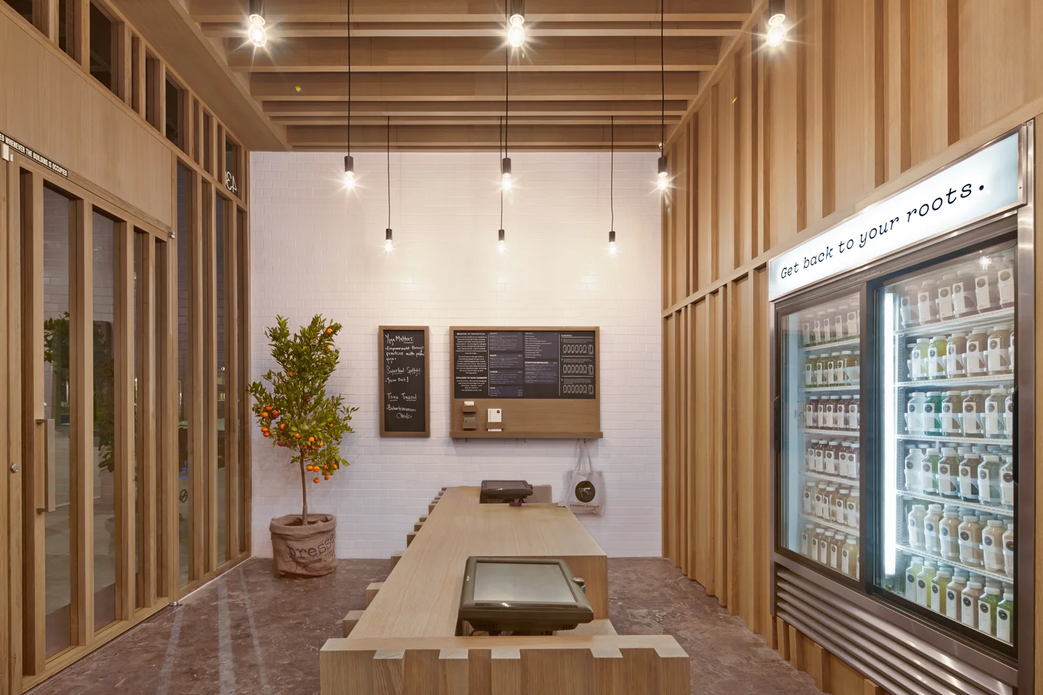
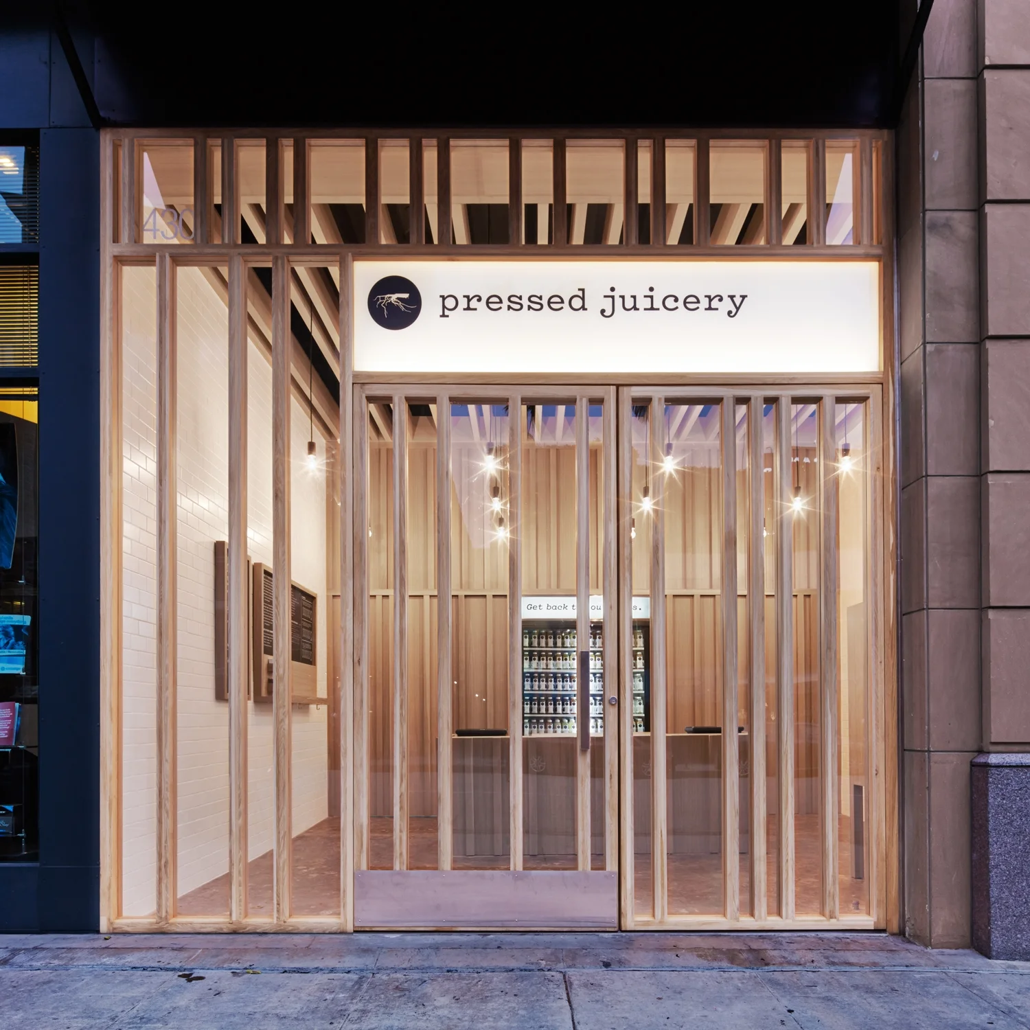
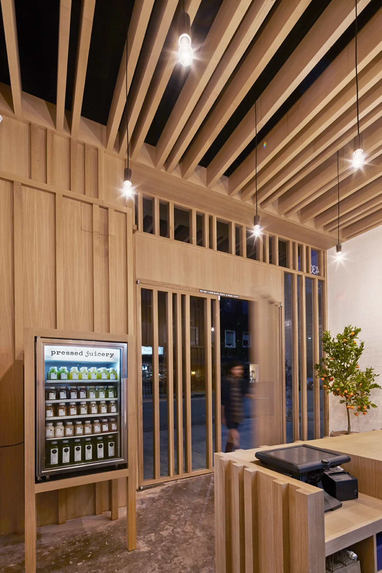
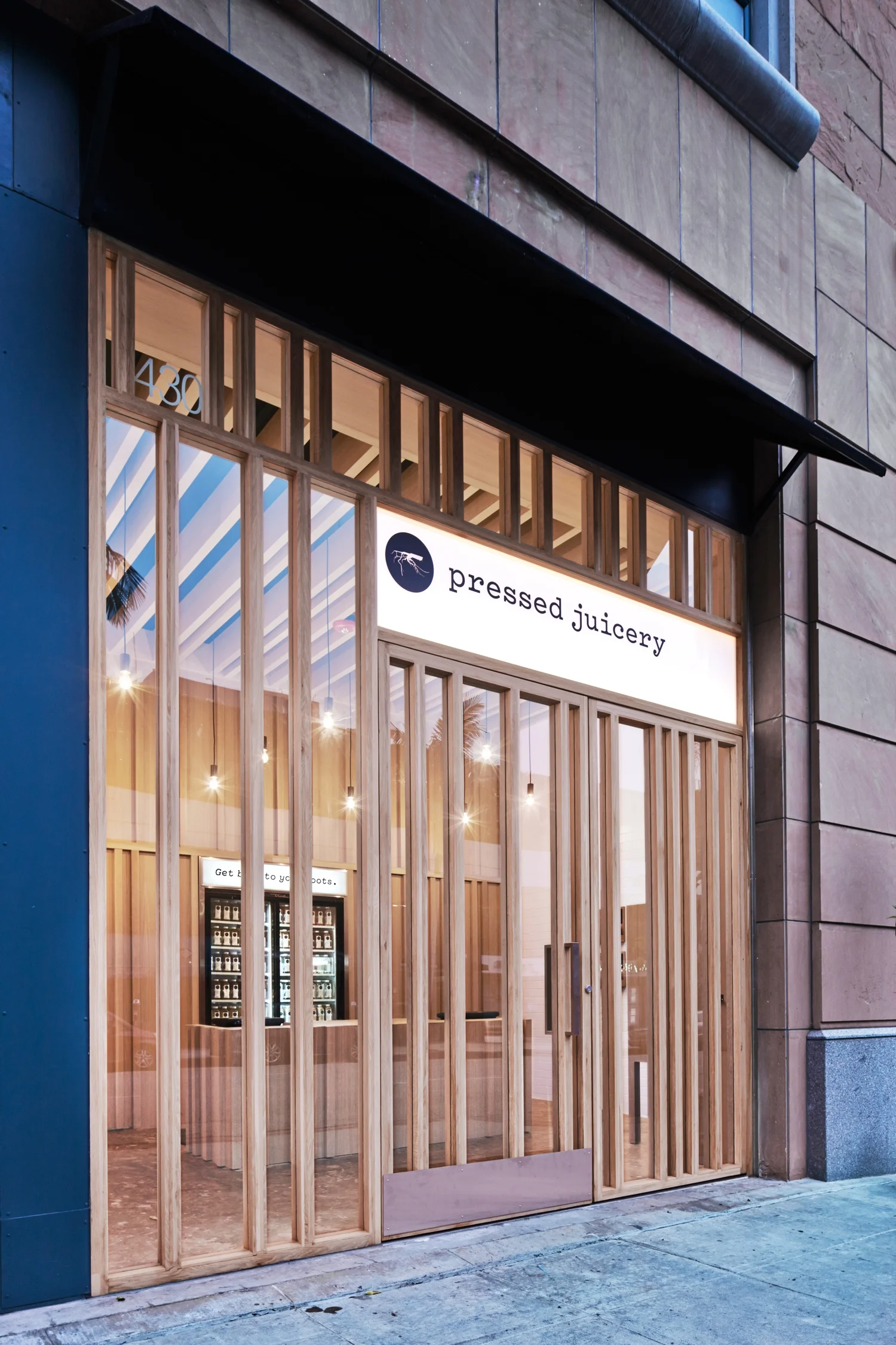
A restrained palette of natural materials, plus access to ample fresh air and natural light, comprises this group of stores—intended as the model for Pressed Juicery’s expansion across California and beyond.
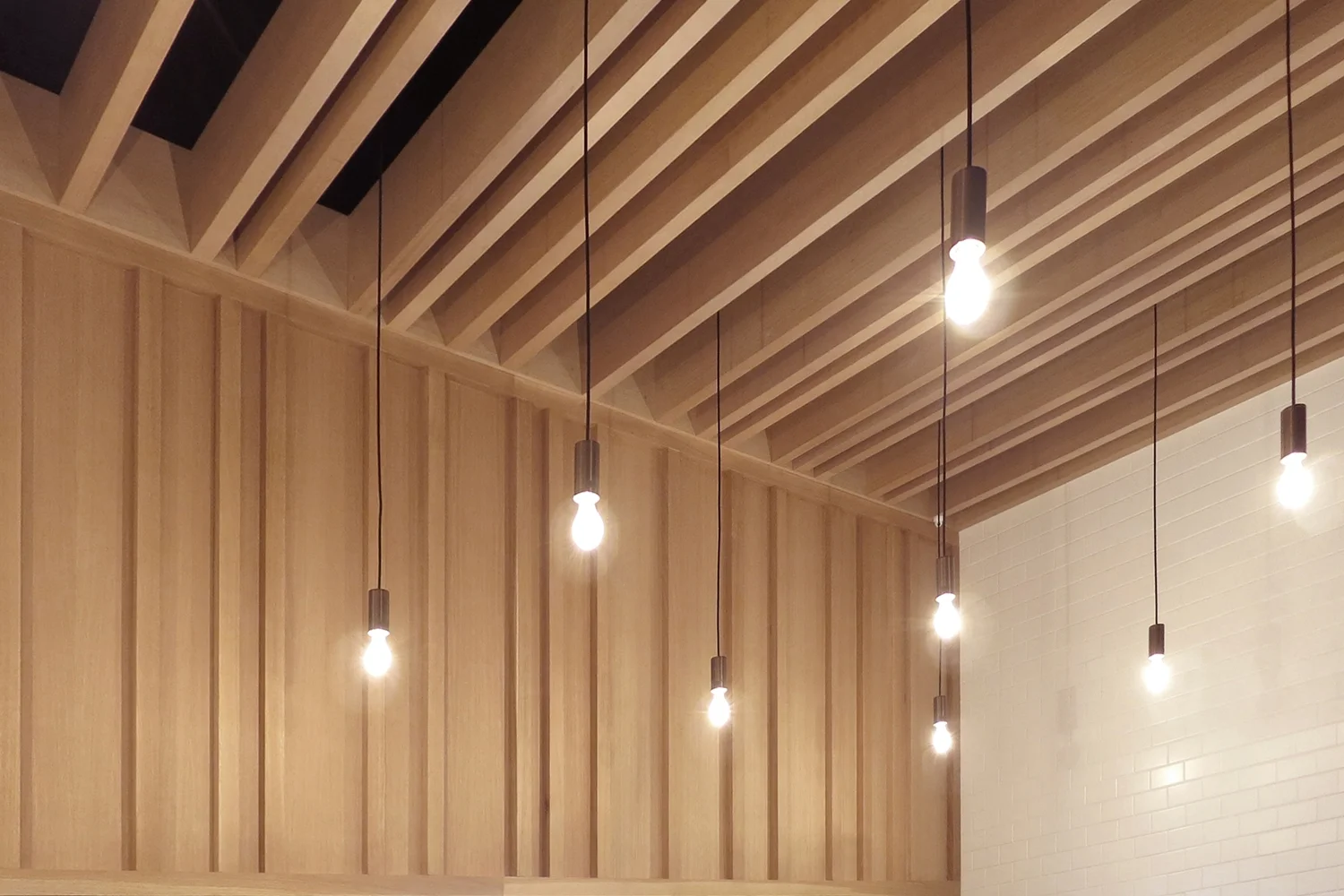
The seemingly random placement of the oak timbers is based on the Fibonacci sequence, a mathematical pattern found in nature, such as in the branching of trees and the spirals of shells. This measured spacing informs the design of the storefront mullions, juice wall, sales counter, and suspended ceiling beams.
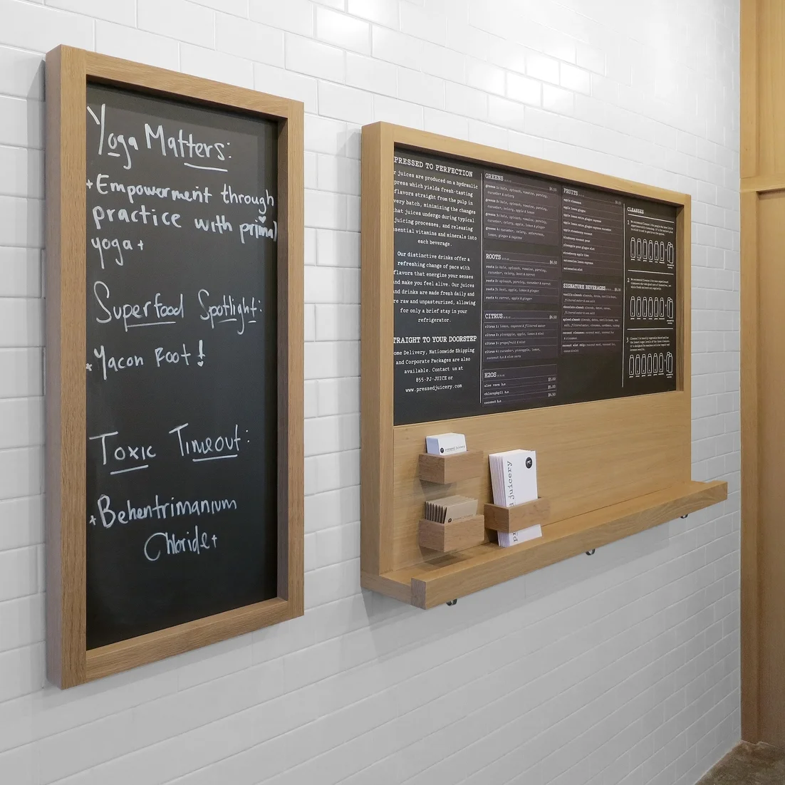
The rhythmically spaced white oak timbers, subway tile, chalkboards, and concrete floor all allow the juice, behind the counter, to take center stage.
DETAILS
Design for eight prototype stores
Los Angeles, CA
350 sq ft
AWARDS
2015 - AIA | LA Design Award
TEAM
Jeffrey Allsbrook, Silvia Kuhle, Tiara Chu, Erin Cuevas, Jenny Ly, Klara Rodstrom, Alexander Babich
Photos ©Benny Chan | Fotoworks
©Standard®

